Basic Macroeconomic Relationships
Before developing the Keynesian Aggregate Expenditures model, we must understand the basic macroeconomic relationships that are the components of that model. The components of aggregate expenditures in a closed economy are Consumption, Investment, and Government Spending. Because government spending is determined by a political process and is not dependent on fundamental economic variables, we will focus in this lesson on an explanation of the determinants of consumption and investment.
Section 01: Consumption and Savings
In the simplest model we can consider, we will assume that people do one of two things with their income: they either consume it or they save it.
Income = Consumption + Savings
In this simple model, it is easy to see the relationship between income, consumption, and savings. If income goes up then consumption will go up and savings will go up. Consider the graph below, which shows Consumption as a positive function of Income:
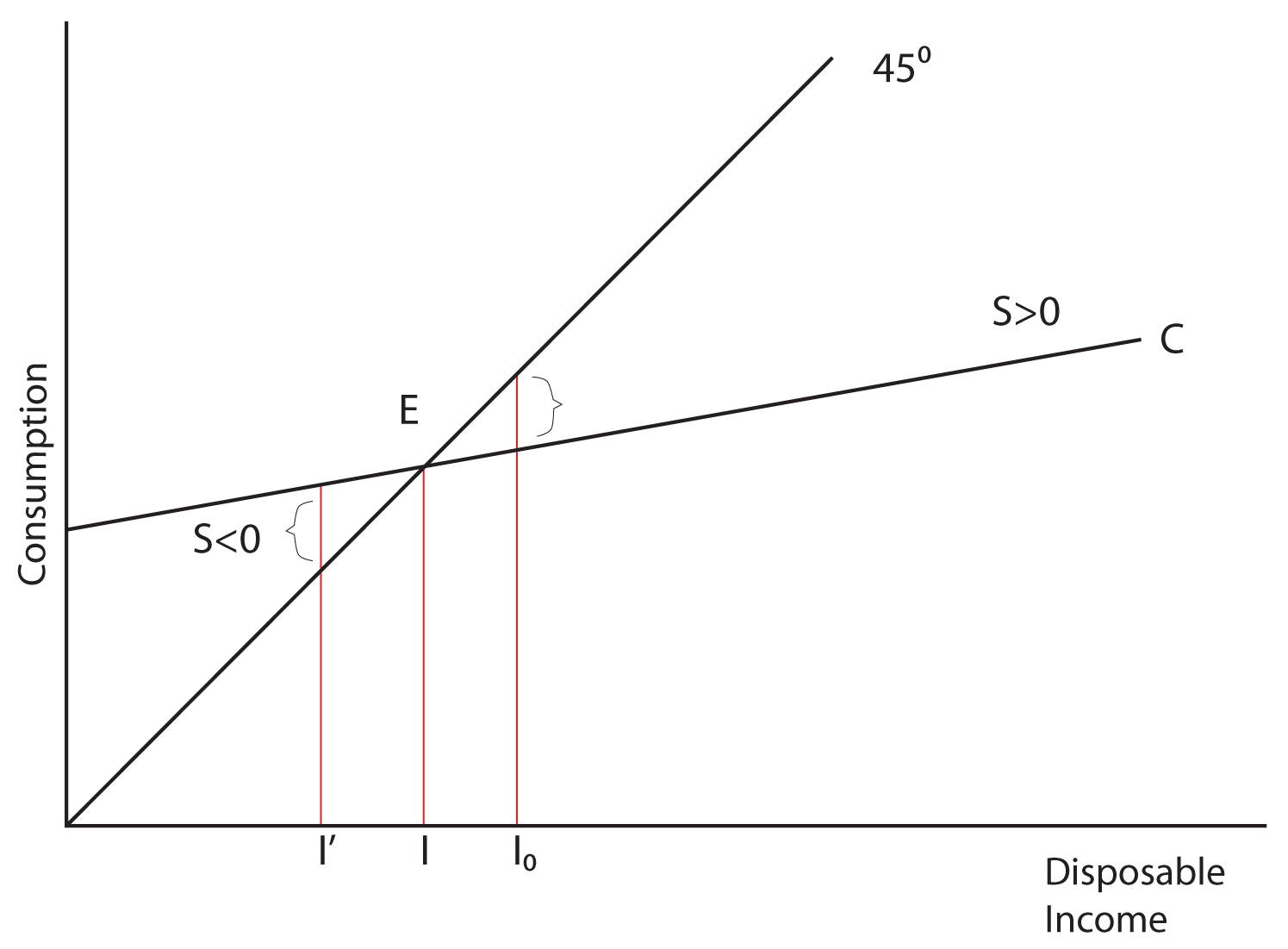
Notice the use of the 45˚ degree line to illustrate the point at which income is equal to consumption. At that point, labeled E in our graph, savings is equal to zero. At income levels to the right of point E (like Io), savings is positive because consumption is below income, and at income levels to the left of point E (like I'), savings is negative because consumption is above income. How can savings be negative? If you thought of borrowing, you are right. In economics we call this “dissavings.” Point E is called the breakeven point because it is the point where there are no savings but there are also no dissavings. The graph below demonstrates the relationship between consumption and savings:
The Consumption Function
The Consumption Function shows the relationship between consumption and disposable income. Disposable income is that portion of your income that you have control over after you have paid your taxes. To simplify our discussion, we will assume that Consumption is a linear function of Disposable Income, just as it was graphically shown above.
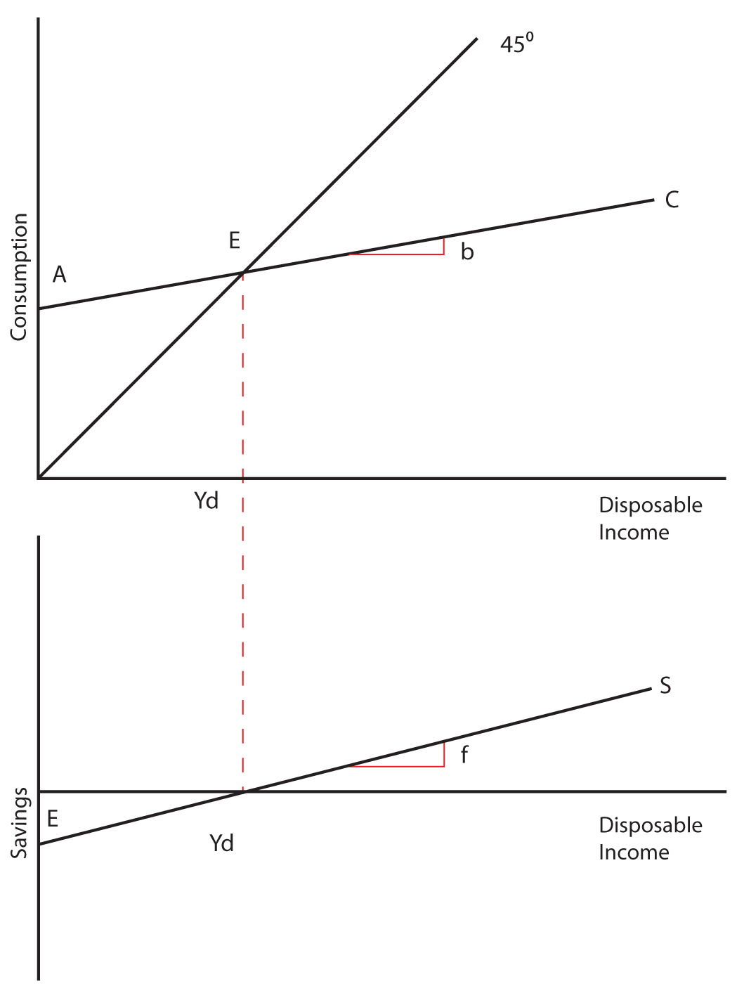
C = a + b Yd
In the above equation, “a” is the intercept of the line and b is the slope. Let’s explore their meanings in economics. The intercept is the value of C when Yd is equal to zero. In other words, what would your consumption be if your disposable income were zero? Can there be consumption without income? People do this all the time. In fact, some of you students may have no income, and yet you are still consuming because of borrowing or transfers of wealth from your parents or others to you. In any case, “a” is the amount of consumption when disposable income is zero and it is called “autonomous consumption,” or consumption that is independent of disposable income.
In the consumption function, b is called the slope. It represents the expected increase in Consumption that results from a one unit increase in Disposable Income. If Income is measured in dollars, you might ask the question, “How much would your Consumption increase if your Income were increased by one dollar?” The slope, b, would provide the answer to that question. It is the change in consumption resulting from a change in income. (Remember the idea of a slope being the rise over the run? Go back to the graph of the consumption function and satisfy yourself that the rise is the change in Consumption and the run is the change in Income, and you will see that this definition of b is consistent with the definition of a slope.) In economics, “b” is a particularly important variable because it illustrates the concept of the Marginal Propensity to Consume (MPC), which will be discussed below.
The Savings Function shows the relationship between savings and disposable income. As with consumption, we will assume that this relationship is linear:
S = e + f Yd
In this equation the intercept is e, the autonomous level of Savings. With savings, it is quite likely that “e” will be negative, which indicates that when Disposable Income is zero, Savings on average are negative. The slope of the savings function is “f,” and it represents the Marginal Propensity to Save—the increase in Savings that would be expected from any increase in Disposable Income.
Marginal Propensities to Consume and Save
The Marginal Propensity to Consume is the extra amount that people consume when they receive an extra dollar of income. If in one year your income goes up by $1,000, your consumption goes up by $900, and you savings go up by $100, then your MPC = .9 and your MPS = .1. In general it can be said:
MPC = Change in Consumption/Change in Disposable Income = ∆C/∆Yd
MPS = Change in Savings/Change in Disposable Income = ∆S/∆Yd
It is also important to notice that: MPC + MPS = 1
Remember, the MPC is the slope of the consumption function and the MPS is the slope of the savings function.
Example
Let’s do an example using data for a hypothetical economy. The data is presented in the table below. From this data I will graph both the Consumption Function and the Savings Function and calculate the MPC and the MPS. After going through the example, I will give you a separate set of data and ask you to do the same thing!
| Disposable Income | Consumption | MPC | Savings | MPS |
|---|---|---|---|---|
| $15,000 | $15,250 | 0.75 | -$250 | 0.25 |
| $16,000 | $16,000 | 0.75 | $0 | 0.25 |
| $17,000 | $16,750 | 0.75 | $250 | 0.25 |
| $18,000 | $17,500 | 0.75 | $500 | 0.25 |
| $19,000 | $18,250 | 0.75 | $750 | 0.25 |
| $20,000 | $19,000 | 0.75 | $1,000 | 0.25 |
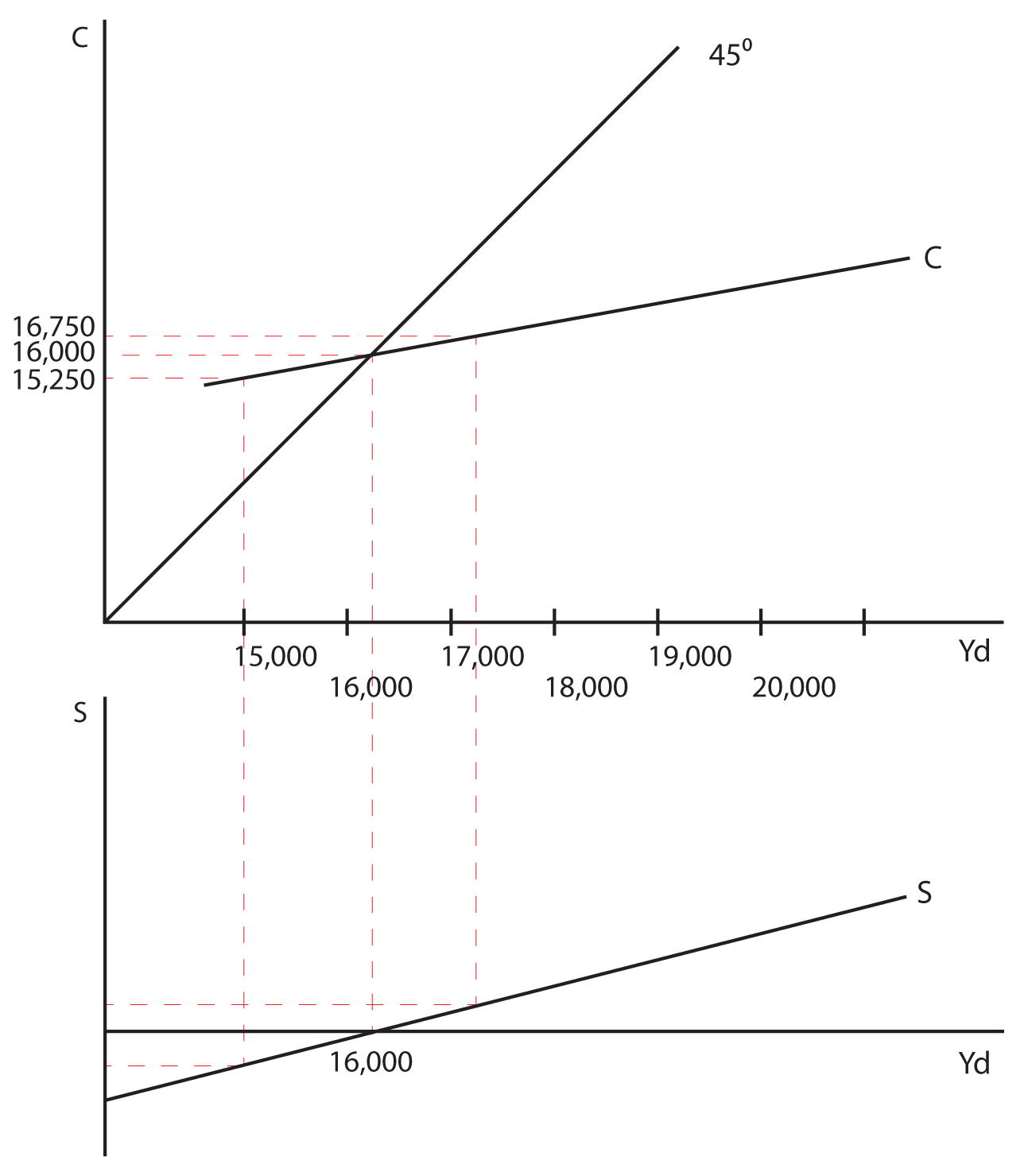
Notice that as you move from an income of 15,000 to an income of 16,000, consumption goes from 15,250 to 16,000 and savings goes from -250 to 0. The MPC and MPS are therefore:
MPC = ∆C/∆Yd = 750/1000 = 0.75
MPS = ∆S/∆Yd = 250/1000 = 0.25
Since the Consumption Function and the Savings Function are both straight lines in this example, and since the slope of a straight line is constant between any two points on the line, it will be easy for you to verify that the MPC and the MPS are the same between any two points on the line. You can also see that that MPC + MPS =1 as was stated earlier.
Think About It: Calculating MPC and MPS
Graph the Consumption Function and the Savings Function for the data provided in the table below. Also calculate the MPC and the MPS in this example.
| Disposable Income | Consumption | Savings | MPC | MPS |
|---|---|---|---|---|
| $4,575 | $4,647 | -$72 | ||
| $4,755 | $4,791 | -$36 | ||
| $4,935 | $4,935 | $0 | ||
| $5,115 | $5,079 | $36 | ||
| $5,295 | $5,223 | $72 | ||
| $5,475 | $5,367 | $108 | ||
| $5,655 | $5,511 | $144 | ||
| $5,835 | $5,655 | $180 | ||
| $6,015 | $5,799 | $216 | ||
| $6,195 | $5,943 | $252 |
Some of the Non-Income Determinants of Consumption and Savings
Notice that when we graph the Consumption Function, Consumption is measured on the vertical axis and disposable income is measured on the horizontal axis. As disposable income goes up, consumption goes up and this is shown by movement along a single consumption function. But there are other things that influence consumption besides disposable income. What if one of these non-income determinants of consumption changes? Since they are not measured on either axis, we should note that a change in a non-income determinant of consumption will shift the entire consumption function not merely move you along a fixed consumption function. Let’s look at several of these non-income determinants of consumption and savings:
- Wealth—In economics wealth and income are two separate variables. A simple example will illustrate the difference. Let’s say that you have a job earning $50,000 a year. If your great aunt Maude dies and leaves you $100,000 in an inheritance, your income is still $50,000 a year, but your wealth has just gone up. The same could be said about sudden increases in the value of a piece of art that you own, the discovery of oil on your property, or increases in the value of your stock portfolio. None of these occurrences increases your income, but they all increase your wealth. An increase in wealth will increase your consumption even at the same income level, and can be illustrated by an upward shift in both the Consumption Function and the Savings Function. Obviously, a decrease in wealth will have the opposite effect.
- Expectations—There are times when consumers adjust their spending, based not on their actual income but rather on their expectations of future changes in their income. Changes in expectations will cause a shift in the curve, because consumption has changed without an actual chance in income. For example, if you think your income is going to go up in the future, you may consume more today. Not that we suggest this as a wise course of action, but it has been observed that some college seniors start to spend more once they have secured a job, even though that job (and its attendant income) will not start for a month or two. This behavior would be illustrated by an upward shift in the consumption function showing that your consumption has increased even though your actual disposable income has not. Likewise, if for some reason you were pessimistic about your future income (rumors floating around the company that layoffs were eminent) you might decrease your consumption, even though your actual current income had not changed.
- Consumer Indebtedness—Consumers adjust their consumption to levels of indebtedness as well. We observe in the aggregate economy that when indebtedness goes up, consumption falls and savings rise. There is a level of debt beyond which consumers feel uncomfortable with additional spending. Even if income has stayed the same, if too much debt accumulates, consumers will start to spend less and pay off debt. This is illustrated by a downward shift in the Consumption Function and an upward shift in the Savings Function (remember that paying off debt is the same thing as increasing savings). The opposite is also true. At low levels of debt people will consume more and save less.


You can likely think of other factors that are unrelated to income that could shift the Consumption and Savings Functions. In general, anything that influences consumption or savings that is NOT disposable income will shift the Functions upward or downward. Any change in disposable income will move you along the Functions.
Return to the course in I-Learn and complete the activity that corresponds with this material.
Section 02: The Interest Rate — Investment Relationship
The second component of aggregate expenditures that plays a significant role in our economy is Investment. Remember from our lesson on National Income Accounting that investment only occurs when real capital is created. Investment is such an important part of our economy because it affects both short-run aggregate demand and long-run economic growth. Investment is a component of aggregate expenditures, so when a company buys new equipment or builds a new plant/office building, it has an immediate short-run impact on the economy. The dollars spent on the investment have the immediate impact of increasing spending in the current time period. But because of the nature of investment, it has a long-term impact on the economy as well. If a company buys a new machine, that machine is going to operate, continue to produce, and will have an impact on the productive capacity of the economy for years to come. This is in contrast to consumption purchases that do not have the same impact. If you buy and eat an apple today, that apple does not continue to provide consumption benefits into the future.
Expected Rate of Return
An important question in the study of investment is, “Why do firms invest?” Investment is guided by the profit motive—firms invest expecting a return on their investment. Before the investment takes place, firms only know their expected rate of return. Therefore, investment almost always involves some risk.
Consider the following scenario. Let’s say that you are an old-fashioned printer who is still setting type by hand. You know that your equipment is slow and outdated. You also know that investing in modern computerized printing presses will yield a positive return for your business, but that they will be very expensive. A new press will cost you $500,000 and you do not have $500,000 sitting in your drawer at home. In order to undertake the investment in new equipment, you will have to borrow the money. Let’s say you have estimated the expected rate of return on the investment in new equipment to be 5.5%. Should you borrow the money and buy the new equipment? What will influence you decision?
The key variable that will help you to decide whether the investment makes sense for you is the real interest rate that you will have to pay on the loan. If the expected rate of return in greater than the real interest rate, the investment makes sense. If it is not, then the investment will not be profitable. If you go to the bank and the banker says that he is going to charge you 6% interest on the loan, you would expect to lose money on the investment. You cannot pay 6% on the loan if you only expect to earn 5.5% on the investment. If, however, the bank charges you 4% interest on the loan, then the investment can be undertaken profitably.
The real interest rate determines the level of investment, even if you do not have to borrow the money to buy the equipment. What if you did have $500,000 sitting in your drawer, and you had to decide whether to buy machines that would yield an expected rate of return for your company of 5.5%. If the real interest rate at the bank is 6%, you would not buy the machines. You would instead put the money in the bank and earn 6%. If the interest rate at the bank were 4%, you would buy the machines because they will yield a higher return than the next best alternative available to you.
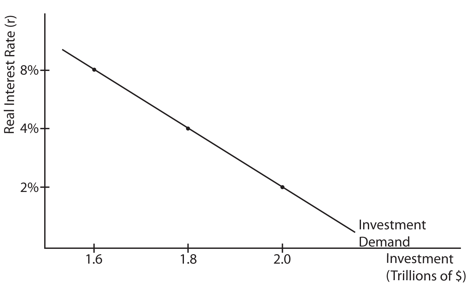
The Investment Demand Curve
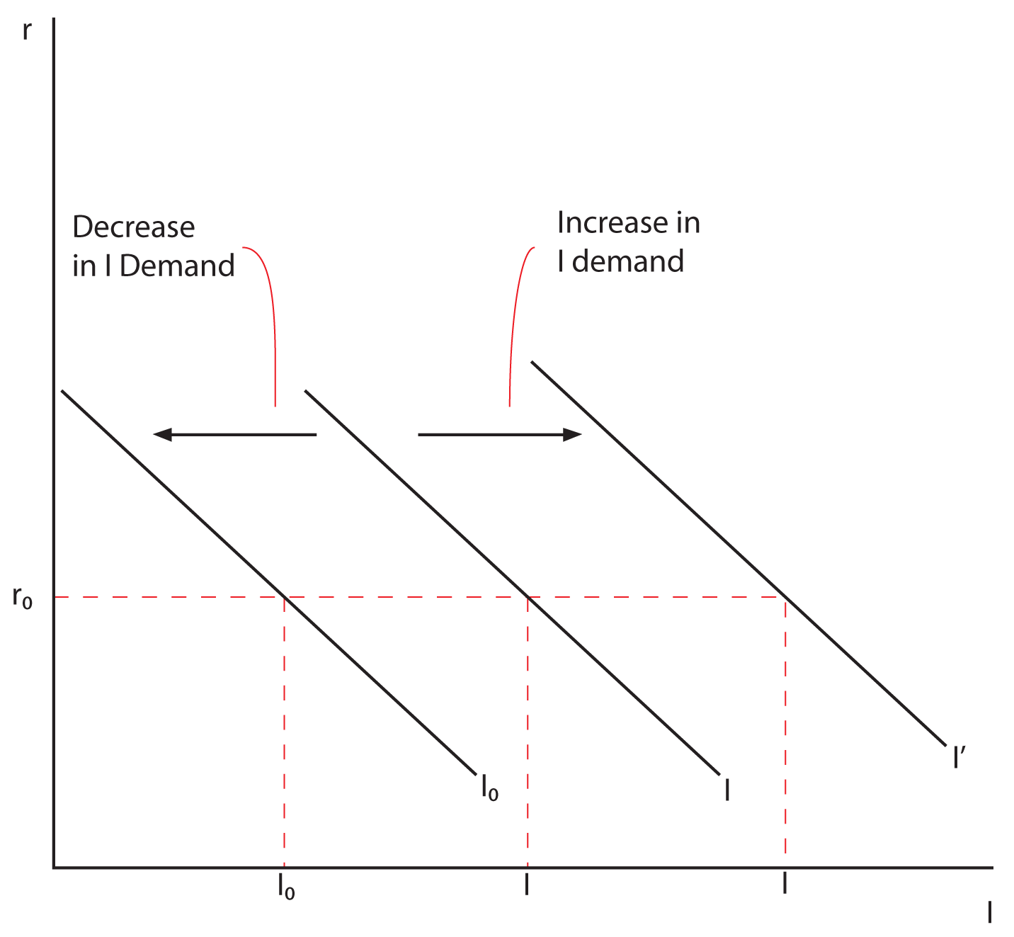
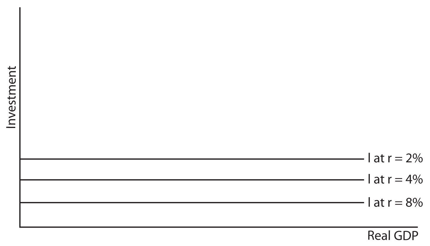
As was illustrated in the example above, the real rate of interest has an impact on determining which investments can be undertaken profitably and which cannot. The higher the real rate of interest, the fewer investment opportunities will be profitable. When the real rate of interest is at 8%, only those investments that have an expected rate of return higher than 8% will be undertaken. If the interest rate is 4%, all investments with an expected rate of return higher than 4% will be undertaken. There are more investments with an expected rate of return higher than 4% than there are with an expected rate of return higher than 8%, so there is more investment at a lower rather than a higher real rate of interest. This inverse relationship between the real rate of interest and the level of investment is illustrated in the Investment Demand Curve shown below.
What Might Cause Shifts in the Investment Demand Curve?
As with the Consumption Function, there are factors that will shift the entire Investment Demand Curve. These are non-interest rate determinants of Investment. While there are many things that can influence the level of investment in the economy other than the real interest rate, we will discuss only three.
- Business Taxes—The government can influence the level of investment by the tax structure they impose on businesses. When the government gives tax incentives for investing in new capital (such as allowing businesses to depreciate new capital at a faster rate, or giving tax credits for new “green” investments), this encourages additional investment at all levels of the real interest rate and shifts the Investment Demand Curve to the right. For example, in the graph below, if the real interest rate is r o, investment is at I o, the government gives tax incentives that encourage investment, then even at the same interest rate we might expect the level of investment to increase to I’. If the government withdraws these tax incentives, then the Investment Demand Curve shifts to the left.
- Changes in Technology—A business will be more likely to increase investment in an industry where technology is changing than in an industry with a more fixed technology. Businesses recognize the need to keep up with competitors’ utilization of modern technology. At any given level of the real interest rate you would expect Investment Demand to be higher the more technology is advancing.
- Stock of Capital Goods on Hand—Businesses that already have a significant stock of capital on hand are less likely to invest in additional capital. For instance, a company that has excess office space or idle plants is not as likely to invest in additional capital as a business that is operating at or beyond capacity. At any given level of the real interest rate, you would expect more investment by a firm that is short on capital goods than by a firm that has an adequate stock of capital on hand.