A
Abstract| A spectrum of simplification in comparison to a representational image. Objects can be slightly simplified (mostly representational), or extremely simplified (nearly unrecognizable), or anywhere in-between the two extremes.

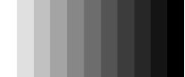
Achromatic Value | Values that are created by using only blacks, whites, and greys. “A” + ”chroma” = no color.
Actual Lines | Drawn, painted, printed etc. lines which describe actual contours, shapes, forms, and spaces. (as opposed to “implied lines” - see below)
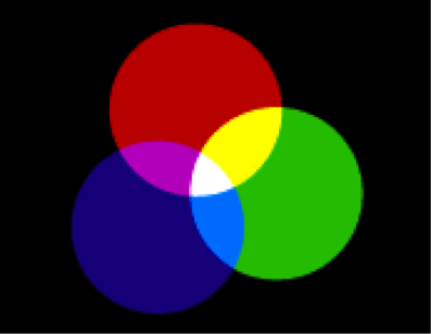
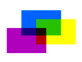
Additive Color |
Color that is created by mixing together the light of two or more different colors to create other colors.
(From Wikipedia:) Computer monitors and televisions are the most common examples of additive color. Examination with a sufficiently powerful magnifying lens will reveal that each pixel in CRT, LCD and most other types of color video displays is composed of red, green and blue sub-pixels, the light from which combines in various proportions to produce all the other colors as well as white and shades of gray. The colored sub-pixels do not overlap on the screen, but when viewed from a normal distance they overlap and blend on the eye's retina, producing the same result as external superimposition.
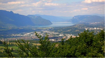
Aerial (Atmospheric) Perspective | The influence of earth’s atmosphere and atmospheric conditions to influence our perception of objects in the distance. As objects get farther from the viewer (and closer to the horizon) they usually appear lighter in value, less detailed (softer edges), cooler in temperature, and exhibit lower value contrast.
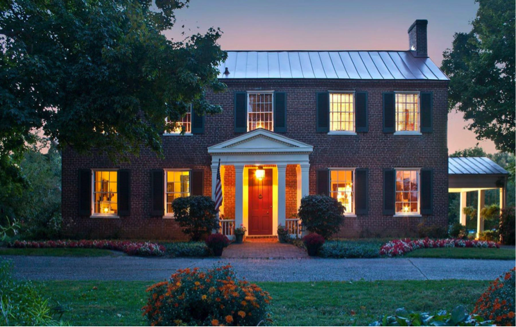
Alignment | A principle of design comprised of lining up the top, bottom, sides, or middle of two or more elements on the page, canvas, wall, etc.. Note the alignment of windows vertically and horizontally in the building below.
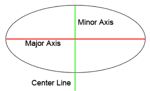
Axis | A straight line that evenly divides the major and minor space divisions of ellipses.
B
Background | The area farthest from the viewer in a piece of art that depicts depth, or the space/value behind the dominant shapes as in graphic design. [foreground, middle ground, mountain].

Balance | A visual sensation that the art is equally weighted compositionally. It can be achieved using the placement and amounts of value, shape, line, texture, and color.

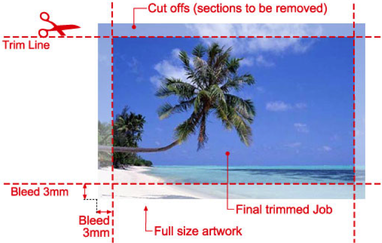
Bleed | The extension of artwork that is beyond the actual dimensions of the piece. Used to avoid white showing on the edges of the print should it be misaligned when cut to size.
Broken Line | Line composed of actual line combined with implied line (see actual line definition above and implied line definition below). A dashed line is a type of broken line.
C
Calligraphic Line | Lines which fluctuate in thickness.
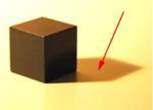
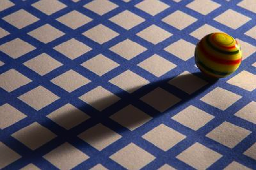
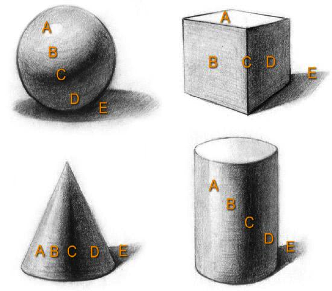
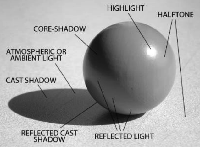
Cast Shadow | The shadow that extends from the core of objects onto other surfaces.
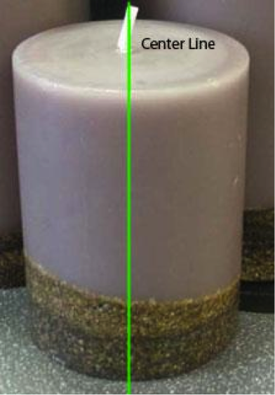
Center Line | A line dividing an object equally through its center.
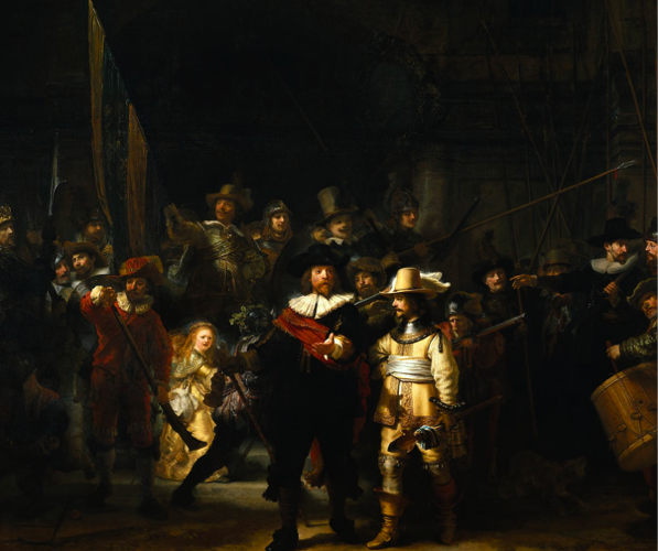
Center of Interest | The most dominant part of a piece of artwork, where the eye is drawn to first. Often referred to as “Main Focal Point” as well.
Chiaroscuro | Usage of strong contrast between light and dark. This style became a popular one during the Renaissance.
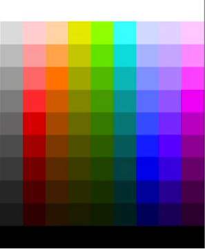
Chromatic Value Scale | A range of color values, usually organized from dark to light or vise-versa.
Color | The visual spectrum of light—red, yellow, blue, green, orange, etc.

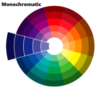
Color Scheme - Monochromatic | A color scheme limited to variations of one color or hue, with all of that color’s tints and shades (values), ranges of temperature, and ranges of saturation or chroma. (Also includes black, white, and greys).
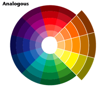
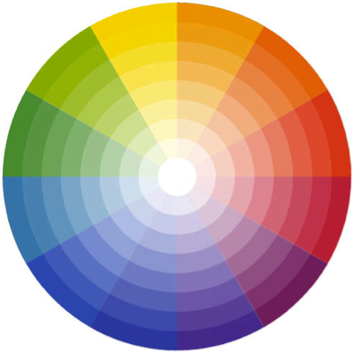
Color Scheme - Analogous | A color scheme that uses colors that are adjacent to each other on the color wheel.
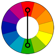
Color Scheme - Complementary | A color scheme that is based on two colors that are opposite each other on the color wheel. Note that the word is Complementary - not Complimentary. These two colors complete each other.
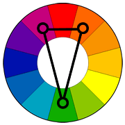
Color Scheme - Split-Complementary | A color scheme based on one color and the two colors that are adjacent to the first color’s complement.
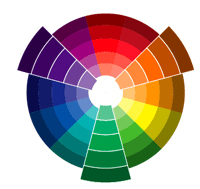
Color Scheme - Triad | A color scheme based on three colors equally spaced around the color wheel.
Composition | The terms “composition” and “design” are sometimes used synonymously. Composition generally refers to the pictorial arrangements of the elements of design in a piece
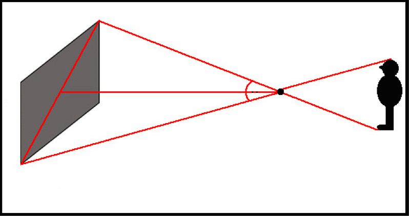
Cone of Vision | People have an approximate 60 degree angle of undistorted vision that extends as an imaginary cone from their eyes forward. Outside of the 60 degree angle, objects begin to be distorted. In linear perspective, it is indicated with a 60 degree angle beginning at the station point.
Concept | The idea for the creation of a piece of art. Concept involves thinking beyond the size, position, angle, value, texture, etc., of the object.
Construction Drawings | Line artwork that shows the process of drawing objects as if they were transparent
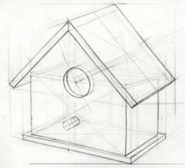
Construction Lines | Lightly drawn lines that are used to develop the proportion, perspective, and shape of objects and compositions.
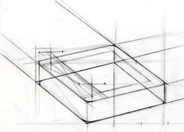
Content | Is the artist’s intended meaning or message contained and communicated within a work of art other than its physical tangible properties, e.g. paint strokes. It includes emotional, intellectual, symbolic, thematic, and narrative connotations.
Continuity | A phenomenon which refers to the pattern by which the eye should travel through an image. A composition contains continuity if the eye led off the page, but instead is allowed to travel around in the image.
Contour Line | Lines which travel along contours or objects in an image, creating the illusion of dimension.
Contrast | Comparison of variations of line, shape, value, texture, and color.

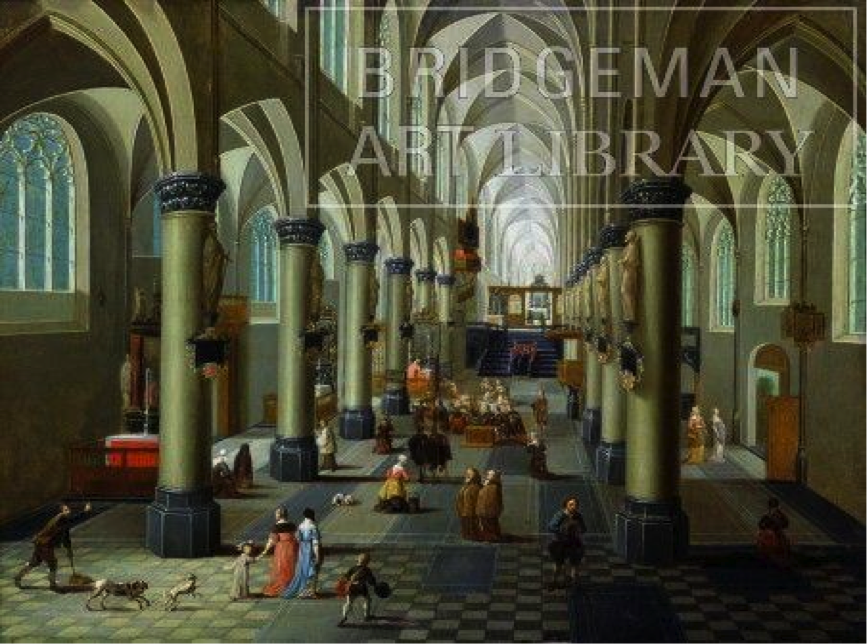
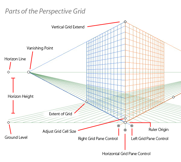
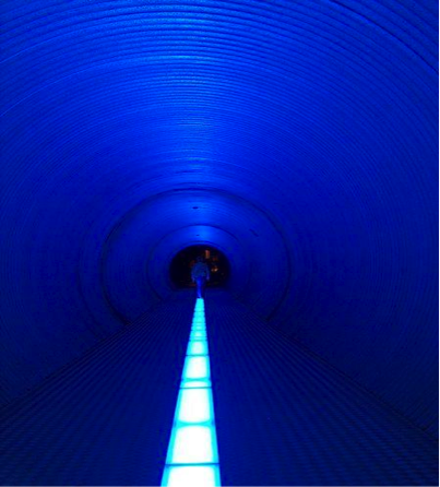
Convergence | The illusion of parallel lines that appear to come together in the distance. The points at which they appear to converge are the vanishing points.

Core "Edge" Shadow | The dark "area of light" on an object that begins where the halftone/direct light ends. A core edge and core shadow are the same things, the edge just refers to an abrupt plane change of the object as on a cube, rather than a gradual edge as on a ball.
Core Shadow | The dark "area of light" on an object that begins where the halftone/direct light ends. On rounded objects it is soft-edged and appears as a band. On right-angled objects it is hard-edged and flat. The shadow marked by "C" represents the core shadow.
Cross-Contour | Drawing technique that uses lines across the contour of a form to create the illusion of dimension. Lines can cross vertically, horizontally, or both.

Cross-hatching | A technique of shading which uses closely spaced parallel lines to create value and effects. Artists use this technique, varying the length, angle, and closeness of the lines to create various effects.
Curvilinear | An “organic” shape formed or characterized by curving lines or edges.
D
Depth | In Art, depth is the illusion of distance from foreground toward the background.
Design | The terms "design" and "composition" are sometimes used synonymously. Except in the definition of "graphic design," the term "design" refers generally to the planning/conceptual intent more than the arrangement of shapes, values, line, etc. (Elements of design.)
Diagonal Line | A line which diagonally bisects the horizontal plane of vision. Diagonals are used in art to simulate motion or create emphasis.
Diminution | The visual effect that objects appear to become smaller in the distance.
Direct Light | Lighting in which the greater part of the light comes directly from the light source to the area lit. An object in direct light will have a "light side", and a "shadow side". The left side of the eggs below are in direct light.
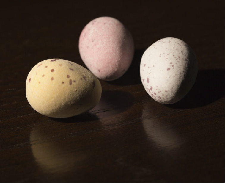
Dominance | When one of the elements of design (e.g. shape, color), is used in a composition more than any of the others. Do not confuse dominance with focal point.
Dry Media | Graphite, charcoal, pastel, etc., used to draw.
Dynamic | Description of a composition, etc. that moves the eye rather quickly through the composition, usually using curved or diagonal lines. This technique is often used to strive for an exciting or energetic feeling to the artwork.
E
Edges-Soft | Gently drawn marks that are less focused as compared to marks or edges that are sharper focused.
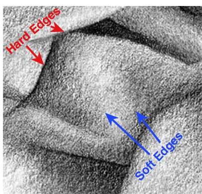
Edges-Hard | Marks that are drawn in sharper focus as compared to marks or edges that are less focused.
Elements of Design | The most basic ingredients/parts used to compose/design art. They are line, shape, value, texture and color in two-dimensional art (e.g. paintings, drawings, etc.). Three-dimensional art (e.g. ceramics, sculpture, etc.) has the added element of space. Film/video has the added element of movement.
Ellipse | An ellipse is a perfect circle that has been foreshortened into perspective. The space above and below the major axis is always equal.
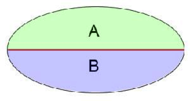
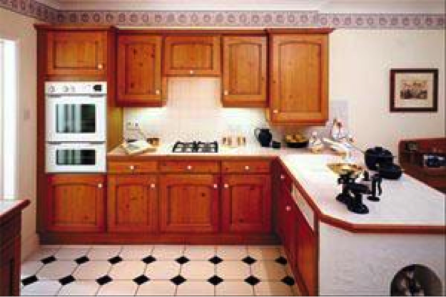
Eye Level | Eye level is the actual height at which the viewer's eyes are when looking at an object, an interior scene, or an exterior scene. It is also a reference line, in linear perspective, that extends parallel (left to right) within a format.
F
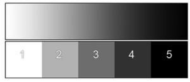
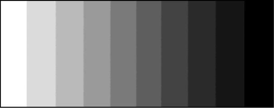
Five-Value Scale | A scale of values evenly stepped from white to black.
Floor Plan | Overhead, "bird's eye view," diagram used to show placement of shapes/objects—generally of interiors of buildings.

Focal Point | Focal points are visual area(s) that are of the greatest emphasis in the composition. They are created using variations of the elements of design. The focal point is usually the first thing your eyes are drawn to in a picture.
Foreshortening | Foreshortening of an object occurs visually when it rotates or turns from the viewer. The result causes its length to appear shorter than it actually is. The illusion of foreshortening can be re-created on a two-dimensional surface by using the principles of linear perspective.

Form | The use of the Elements and Principles of Design as well as the physical tangible properties of the art (e.g. thickness of paint, paint strokes, proportion, format, etc.).
Format | The measureable height and width of a drawing, illustration, painting, photograph, graphic design, in 2-dimensional art.
Frisket | A masking paper or a film that is placed on top of a drawing to shield selective areas from receiving unwanted value during the drawing process.
G
Gesture | Lines that imply the suggestion of movement, especially of human or animal forms.
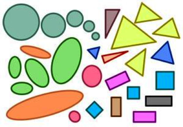
Geometric Shapes | "Geometric shapes" refers to shapes that are two dimensional in nature (e.g. circles, squares, ovals, logos, symbols, etc.) as in graphic design. Also, man-made objects such as cylinders, cones, cubes, boxes, or combinations of these. The opposite of geometric shapes are organic shapes.
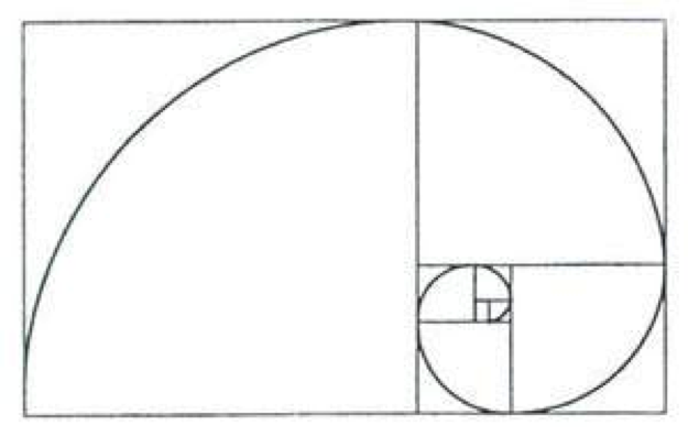
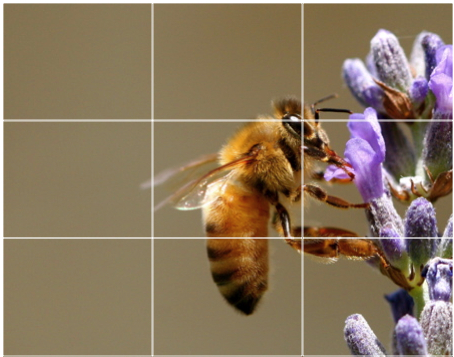
Golden Section | A mathematical ratio evident in nature. The ratio is .618 to 1; about 8 dashes to 13 (--------/-------------) or 2.5 to 3.5. The rule of thirds is a close approximation of the golden section units.
Gradation | Incremental steps when going from light to dark, neutral to intense, warm to cool, rough to smooth, etc.

Ground Measuring Line | A linear perspective term. It is used to measure foreshortened length (true length) coupled with the vanishing points and measuring points.
H
Half Tone | The total area of an object, surface plane, etc. that is illuminated by the dominant light source.
Harmony | When all individual parts of an artwork, ie: elements, principles, objects, colors, values, etc., work together to make a better whole, the result is said to be in artistic “harmony”.
Hierarchy | The act of placing items in a hierarchy, ie: tallest to shortest, oldest to youngest, etc.. Effective designers determine the importance of every specific element in a composition, etc. from most important to least important, then give the viewer visual cues to communicate that hierarchy and to create dominance and subordination.
High Definition | Images that are characterized by a high level of detail, sharpness, and clarity. (I don’t use this term - leftover from Lana(?). Do we keep?) TT
High-Key | When a piece of artwork is created using predominantly lighter values (can be achromatic or chromatic) it is considered a high-keyed composition. High-key compositions can create a “softer”, “lighter”, or more “peaceful” feeling (but this is not an absolute rule).
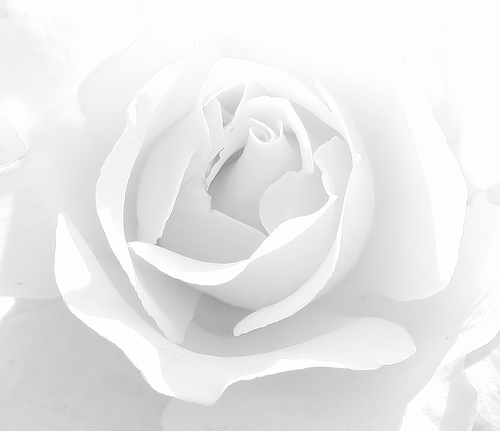
Highlight | The brightest area of light on an object. It is always within the halftone. Area “A” in the picture below.

Horizon Line | Horizon line refers to a physical/visual boundary where the sky and the land are separated. The term “horizon line” generally refers to drawings that are outdoors. It is sometimes used synonymously with the term “eye level.”
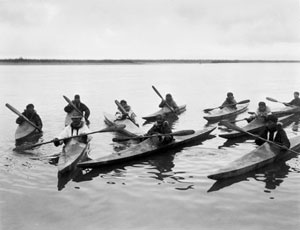
Horizontal | All lines or edges that are parallel to the top or bottom of a two dimensional rectangular format, and/or parallel to the viewer’s eye level.
Hue | Synonym of Color - usually inferring the base or actual color without adding black or white.
I
Implied Lines | A line that is suggested or implied rather than actually drawn/painted, etc.. The viewer’s brain connects or completes the shape rather than an actual line doing so.
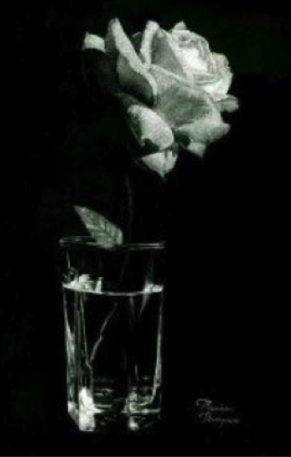
Isolation | A separating segregation by contrasting values, patterns, size, color, texture, subject matter, negative shapes, etc.
J
K
L
Lift-out Method | A drawing technique used to create the half-tone and highlights by erasing.
Light and Shadow | A term in art referring to the “Areas of Light,” e.g. highlight, halftone, core, reflected light, cast shadow, reflected cast shadow, mirror image, and atmospheric light.
Light | The term “light” can have several different meanings, ie: gospel meanings, secular meanings, etc.. As an artistic term, light follows certain universal rules (for example, it normally can’t bend around a corner without a mirror or other aid). The human eye and brain, through constant exposure since birth, has learned to translate these light and shadow patterns into three-dimensional form. Photographs capture these patterns, which is why photographs appear “realistic”. Artists who are capable of replicating these light and shadow patterns are able to create the illusion of 3-dimensional objects on a 2-dimensional surface (paper, canvas, etc.)
Light Bands |
Line of Sight | An imaginary reference line that extends straight forward, perpendicular to the viewer's eyes. It is whereever the viewer is looking.
Line | One of the five elements of design.
Line Quality | A term referring to the visual attributes of a line (hard/soft, curved/straight, thick/thin, dark/light, etc.).
Linear Perspective | A principle in two-dimensional art used to create the illusion of three dimensions / volume and depth. It is based on how we visually perceive the world.
Local Color | A term referring to the actual color/hue of all things (red, green, orange, blue, yellow, etc.).
Local Color Value | A term referring to the inherent value of all things due to its color or hue. As an example, the local color value of blue is darker than the local color value of yellow.
Lost and Found | A term used to describe an element which “stops” and then “starts again” elsewhere on the page. The viewer’s eye (brain) fills in the empty space, connecting the imaginary or implied lines.
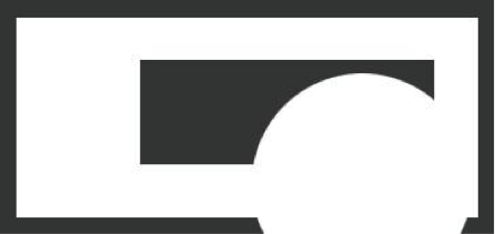
Low Definition | Images that are not sharply defined through the lack of fine detail. (I don’t use this term - leftover from Lana. Do we keep?) TT
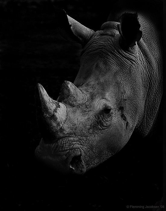
Low-Key Value | When a piece of artwork is created using predominantly darker values (can be achromatic or chromatic) it is considered a low-keyed composition. Low-key compositions can create a “darker”, “ominous”, or more “dramatic” feeling (but this is not an absolute rule).
M
Mass |
Measuring Point | A linear perspective term used to measure foreshortened length coupled with the vanishing points and the ground measuring line. It is always located on the eye level.
Mirror Image | The name given to an "Area of Light" for images that are projected onto a reflective surface.
N
Non-representational | Shapes that are not intended to be recognized as representing any real object.
Negative Space | The subordinate space surrounding dominant shapes within a format.
O
One Point Perspective | A work of art in which all parallel lines converge at a single vanishing point creating the illusion of three-dimensional space and depth on a two dimensional surface. The vertical and horizontal lines are parallel to the vertical and horizontal sides of the picture plane/format, and the vanishing point is on the eye level.
Organic Shapes | Generally natural objects, such as plants and animals. Organic shapes have lines that are usually free and irregular. The opposite of organic shapes are geometric shapes.
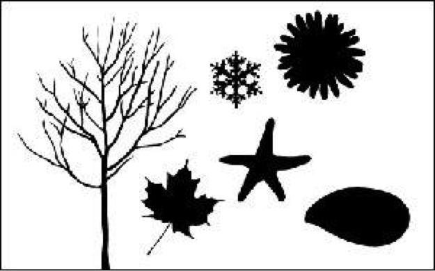
Overlapping | A technique that places one object in front of the other, in two-dimensional art, used to create an illusion of depth.

P
Paper Stump | A commercial drawing tool composed of tighly rolled paper with the appearance of a pencil. It is used to blend/smooth dry media, i.e. charcoal, graphite, pastel.
Parallel | Lines, shapes, or edges that are always the same distance apart and yet appear to converge to a common point, i.e. a vanishing point.

Pattern | Regular repetition of an element or elements in a piece of art.
Perspective | A set of universally applied drawing principles that are used to create the illusion of three-dimensional volume and depth onto a two-dimensional surface.
Picture Plane/Format | The working space within which a two-dimensional painting, drawing, illustration, photograph, design, etc. is created.
Pitch | The degree of inclination or angle of a plane. The greater the pitch, the narrower the visible area. [fix]
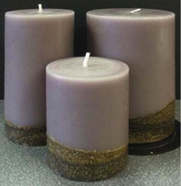
Plane | A flat, two-dimensional surface that can extend vertically and horizontally in any direction. For example, a cube has six equal planes that are either parallel or intersect/meet each other.
Plumb Line | Horizontal or vertical lines used to determine size, position, and angle of objects.
Positive Shapes | The dominant areas within a work of art. They are usually three-dimensional objects in two-dimensional art.
Principles of Design | How one applies the "elements of design" to create art. Some principles of design include: balance, harmony, repetition, unity, contrast, variety, dominance, focal point, etc.
Proportion | The relationship/ratios of sizes, positions, and angles of one part to another. An object that is drawn in proportion is an accurate reflection of the ratios of the actual object.
Proximity | The arrangement of shapes that are placed near each other in a format used to create a sense of balance, dominance, focal point, etc.
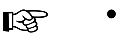
Psychic Line | Synonym of Implied Line. The brain creates a "line" that connects one point to another. For example, when pointing to something, the eye travels from the hand to an object as if there were a connecting line.
Q
R
Rectilinear | A “mechanical” shape that is formed by using only straight lines.
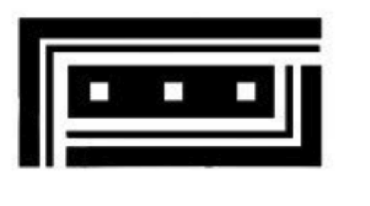
Reference Point | A linear perspective term, used to assist in transfer of scale.
Reflected Cast Shadow | An "Area of Light" of the cast shadow which is reflected back onto the shadow side of the object.
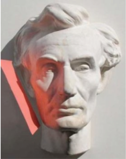
Reflected Light | An "Area of Light" on the shadow side of an object, illuminated by light bouncing onto it from an adjacent halftone. The reflected light is essential to identify the core shadow.
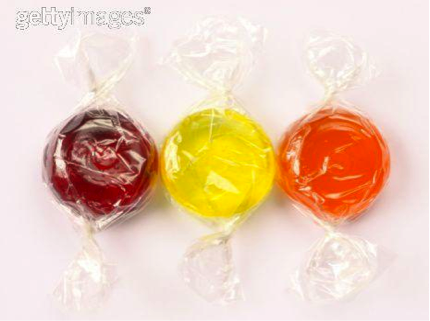
Repetition | Is a principle of design that repeats elements (line, value, texture, shape, color) to create unity.
Representational | Artworks which depict (replicate) recognizable, visual objects within the physical world, such as people, places, and things.
Rhythm | A "principle of design" which uses regularity within an image, such as pattern, to create the illusion of movement.
Rule of Thirds | A general guideline used in the arrangement of focal points within a composition.
S
Saturation | The measurable pureness or full strength of a color in comparison to a grayed version of it. Synonym of Chroma. See the saturated (outside) to unsaturated (inside) example below.
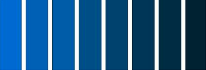
Shades | A new color that is created by mixing black into an existing color, which makes it darker and less saturated. The opposite of a shade is a tint.
Shape | An "element of design" which is a two dimensionally enclosed area. They can be either geometric, organic, or a combination of both.
Skyline | A term describing where the sky meets the mountain, building, tree top, etc.
Space | An "element of design" in three-dimensional art only, i.e. sculpture, ceramics. Two-dimensional art creates an illusion of space by effectively using the elements and principles of design.
Spider Method | A quick way to create perspective angles in a 2 point drawing. The perspective angles visually appear like spider webs.
Space | An "element of design" in three-dimensional art only, i.e. sculpture, ceramics. Two-dimensional art creates an illusion of space by effectively using the elements and principles of design.
Station Point | A linear perspective area that designates the viewer's or intended viewer's location, in one, two, and three point perspective. It is always placed at the apex of a 90 degree angle.
Starburst Method | A quick way to create perspective angles in a 1 point drawing. The perspective angles visually appear like a starburst.
Still Life | A term referring to an arrangement of 3-dimensional objects of which the artist intends to draw or paint.
Subordinance | When one or more of the "elements of design" are used in a composition with less emphasis than any of the others.
Subtractive Color | What we normally think of when combining different colors of pigment, paint, ink, etc.. As colors are combined, they reflect a "new" color back to the viewer's eye. This is termed "subtractive" because we are subtracting light from the light source.
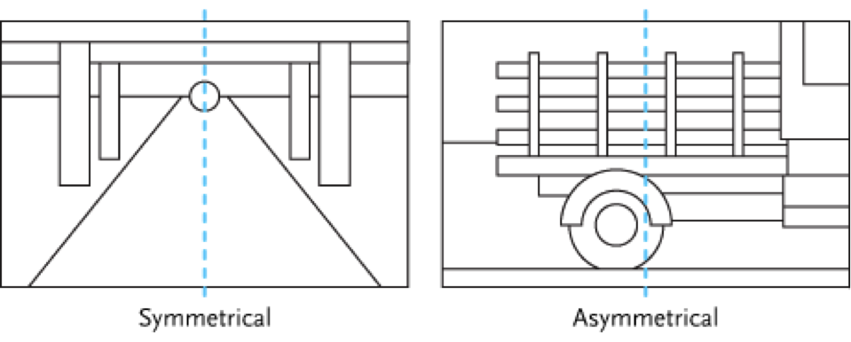
Symmetrical | A visual sensation that the art is equally weighted compositionally. It can be achieved using the placement and amounts of value, shape, line, texture, and color.
T
Tangents | The alignment of edges of objects in a composition so that they just touch, or nearly touch, each other. This makes the design visually confusing and irritating.
Temperature | The degree of measurable warmth or coolness of a color in relationship to another color. While we normally think of reds, yellows, and oranges as being warm colors, and blues, greens, and violets as cool colors, temperature is always relative. In other words, whether a color is “warm” or “cool” depends upon the other color(s) we are comparing it to.

Texture | An "element of design" referring to the illusion of how something feels or how it would look if touched. It is also the use of non-representational lines, values, and colors to add balance to the composition, such as paint strokes, cross-hatch marks, etc.
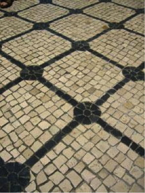
Three Dimensional Shape | Pertaining to the length, width, height, and depth of real or imagined objects; the illusion of which can be rendered using linear perspective.
Tints | A new color that is created by mixing white into an existing color, which makes it lighter and less saturated. The opposite of a tint is a shade.

Tooth | Refers to the surface texture (smoothness or roughness) of paper, illustration board, canvas, etc.
Transfer of Scale | The term "scale" in this defintion is synonomous with the term "size" i.e. height and length (including foreshortened length). It is a way to maintain and record the accurate proportion produced by the visual effect of diminution as an object moves above or below the eye level/horizon line, or towards or away from the viewer in a drawing.
Transfer Paper | A piece of paper used to compare lengths or widths on a drawing. It made by roling up a piece of paper and flattening it.
True Height | A linear perspective term referring to the reference vertical height of an object, which is subsequently used to transfer its scale (forward or backward) within the format.
True Length | A linear perspective term referring to the reference horizontal length of an object, which is subsequently used to transfer its scale (forward or backward) within the format.
Two Point Perspective | A work of art used to create the illusion of 3-dimensional space and depth in which all parallel lines converge at two vanishing points on the horizon or eye level line. Only the vertical lines are parallel to the vertical sides of the picture plane/format.
Two Dimensional Plane | Flat surface used for creating art, i.e. paper, canvas, etc.
U
Unity | The effect when all elements, principles and aspects (form and content) of an image appropriately belong together.
V
Value | Referring to the darkness or lightness of an object or an area, whether the object is in color or black and white. [split]
Vanishing Point | In linear perspective, it is a specifically designated area on the horizon/eye level to which parallel lines converge. VP1 is to the left of the station point/line of sight. VP2 is to the right of the station point/line of sight. VP3 is above or below the horizon line and is at the station point.
Variety | A "principle of design" in which differences, alterations, changes, and contrasts of line, shape, value, texture, color are shown in artwork.
Vertical Measuring Line | A linear perspective term coupled with vanishing points used to transfer and measure vertical scale (true height).
Vertical Line | A line that is angled 90 degrees/perpendicular to the horizon/eye level or format (bottom or top).
Visual Gravity | The illusion that shapes appear to have been or are being affected by the Law of Gravity within a piece of art.
Visual Pace | The speed at which the eye moves through the piece of art.
Visual Weight | An element, or part of a composition, which commands more attention in comparison to other elements, or parts. This is usually achieved using value or color contrast.
Volume | Leon, remind me of Matt's analogy about Mass vs. Volume? TT