Course Introduction: Math Review
Section 01: Math Review
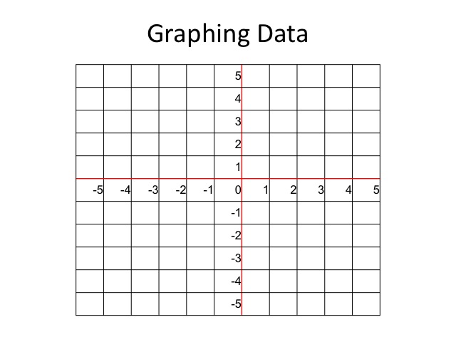
Graphing Data
It is said that a picture is worth a thousand words. Likewise, a graph can often be used to better understand relationships between variables. Recall that on a graph, there is a horizontal axis and a vertical axis.
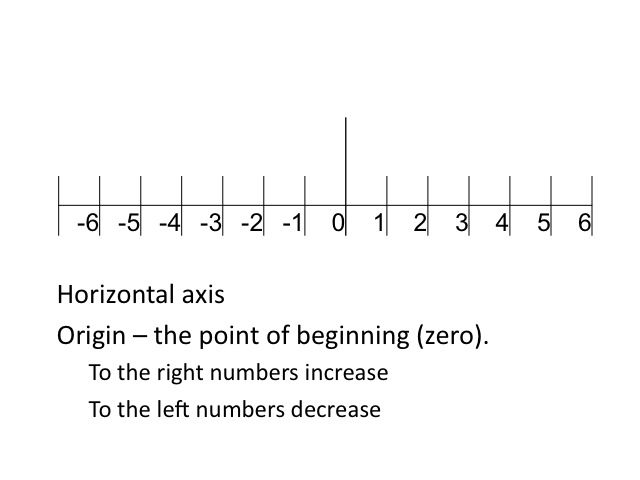
Along the horizontal axis, we start at the origin or a zero. To the right numbers increase and to the left numbers decrease.
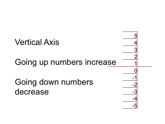
On the vertical axis, we also start at the origin or zero. The numbers increase as we go up and decrease as we go down.
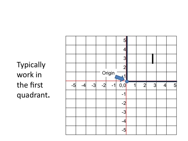
Combining the horizontal and vertical axes allow us to look at the relationships between variables in two-dimensional space. While we will, at times, use all four quadrants, we typically spend most of our time in the first quadrant or the space where both the horizontal and vertical variables are positive.
Plotting Points on a Graph
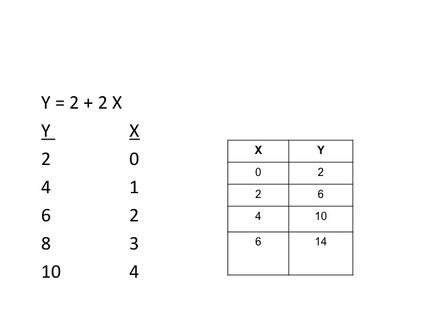
If the various values of x and y are given, the points can be plotted on the graph.
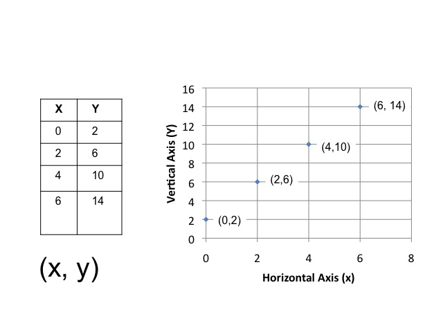
Once the points are plotted, the dots can be connected to form a line or curve.
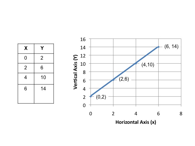
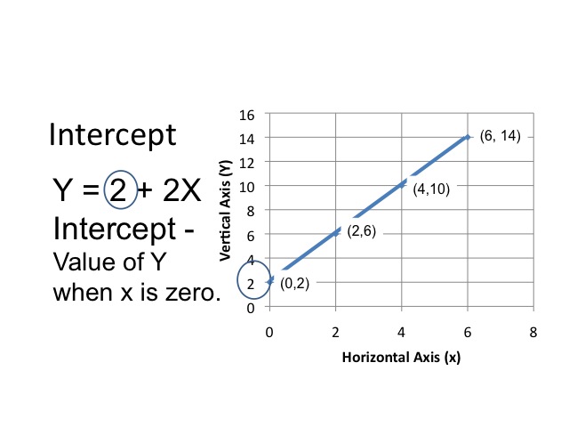
In our example, there is a linear relationship between x and y. We can express the same information, using an equation. The intercept value is the value of y when x is zero.
In modeling causal relationships, the value of an endogenous or dependent variable depends upon the value of other variables in the model. When graphing, we typically place the dependent variable on the vertical or y-axis. Those variables whose values are determined outside the model are known as exogenous or independent variables. These are typically graphed on the x (or horizontal) axis.
A positive or direct relationship between the two variables occurs when the increase in the independent variable causes an increase in the dependent variable. For example, as income increases, the amount people will consume also increases.
A negative or inverse relationship occurs when the increase in one variable decreases the value of the other variable. As the price of a good falls, the number of people willing to buy the good increases.
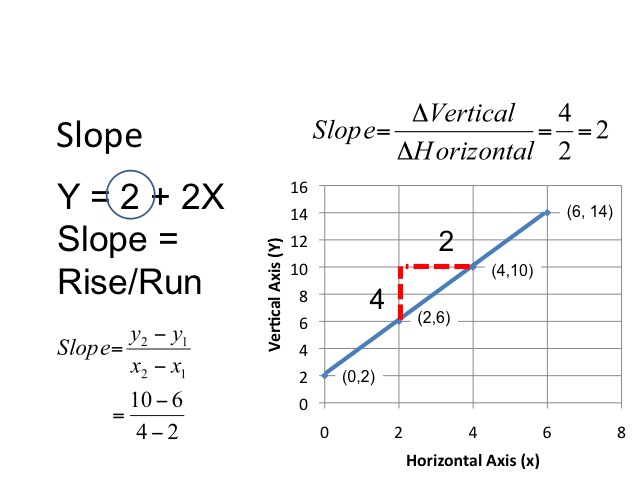
In our equation, there is a positive relationship between x and y. When x increases by one, y increases by 2. The slope of a line is determined by taking the change in the vertical amount divided by the change in the horizontal amount. We will let the Greek symbol Delta represent the change. In our example, as x increases by 2, y increases by 4, so the slope would a positive 2.
From an equation, we are able to derive the points in a table by plugging in the values of x and computing the value of y.
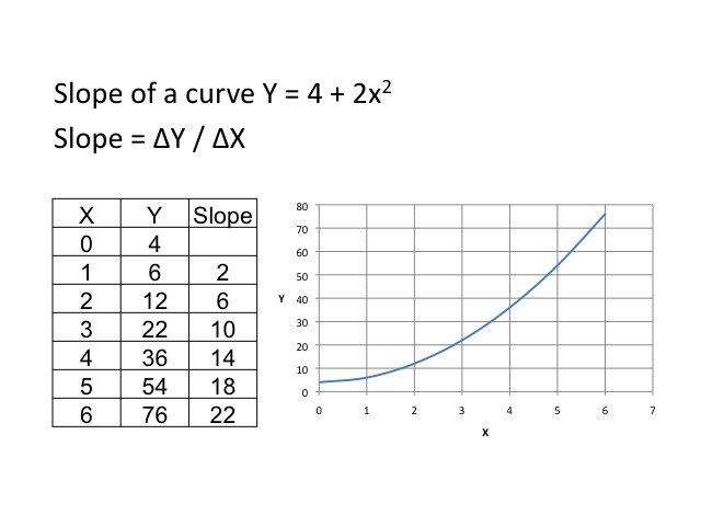
Slope of a Curve
A curve will have different slopes at different points along the curve. By taking the change in y over the change in x, we are able to get an estimate of the curve at that point. As shown in the table, the slope gets steeper as we move along the curve.
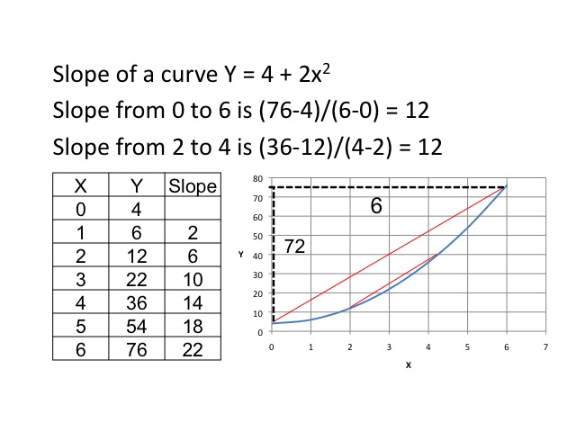
If we compute the slope over a distance around three, we find that the slope from 0 to 6 is 12, and from 2 to 4 is also 12.
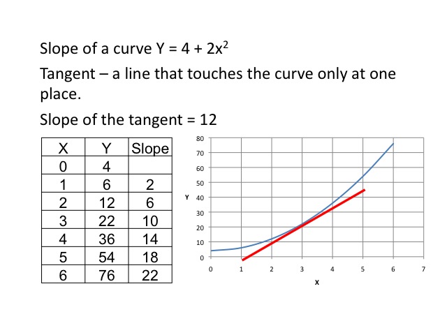
If we were to draw a tangent line (a line that touches the curve only at one place) where x equals 3, we could then compute the slope of the tangent. In doing so, we would find the slope is again 12.
Marginal Analysis
One of the key tools in economics is marginal analysis. As economists look at relationships between variables, they want to know what will be the change in one variable, given a change in another variable. As the change in x gets smaller and smaller, we find the slope of the tangent. Thus, being able to compute the slope of the tangent tells us the marginal change in the dependent variable.
Slope of the tangent = ΔY / ΔX as the change in x gets very small
One powerful mathematical tool in calculus is called the derivative. The derivative tells us the slope of the curve at a particular point. Although it is not a requirement for this class, an example is provided for those who have previously had calculus. The derivative simply tells us the change in y given a very small change in x, or in other words the slope of the curve at a particular point. Given the function, Y = 4 + 2x2, the first derivative gives us a slope of the tangent at a given point. To find the slope of the tangent when x = 3, we plug in the value of 3 for x in the first derivative, and find the slope is 12.
The derivative gives us the slope of the curve.
ΔY / ΔX = slope of the curve
Y = 4 + 2x2
First derivative = ΔY / ΔX = 4x
Slope of the tangent when x = 3 is 4(3) = 12
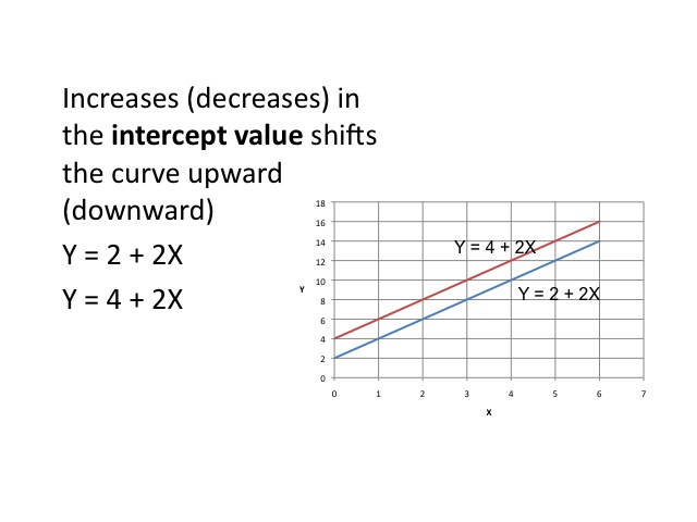
Increases in the intercept value shifts the curve upwards by the amount of the increase in the intercept. In our example, the intercept value is increased from 2 to 4.
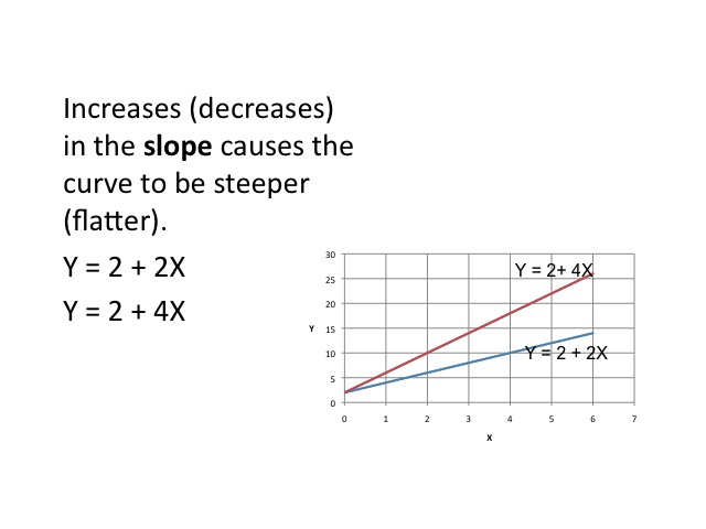
Increases (decreases) in the slope causes the curve to be steeper (flatter).
Equilibrium
Often, we want to find an equilibrium where the one curve would intersect with another, such as with supply and demand.
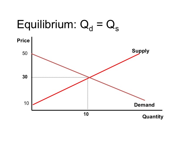
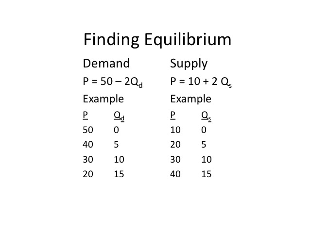
We are able to find the market equilibrium either by graphing or algebraically. If on the demand side, we are given Price = 50 – 2 (Quantity Demanded) and on the supply side, we are given Price = 10 + 2 (Quantity supplied). We could simply plug in values, plot the points, and find where demand intersects supply.
Even without graphing the curves, we are able to see that at a price of $30, the quantity demanded equals the quantity supplied.
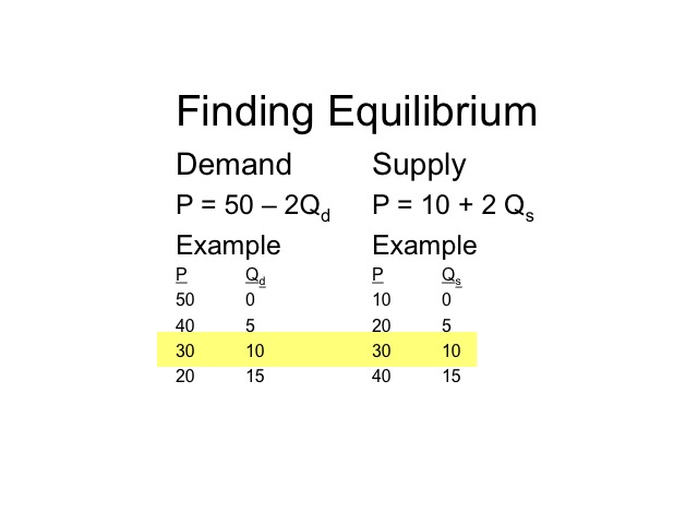
If we graph it, we find that at price of 30 dollars, the quantity supplied would be 10 and the quantity demanded would be 10.

Solving Algebraically
An alternative way, is to solve the problem algebraically. Since at equilibrium the quantity supplied equals the quantity demanded and the price will be the same for both. We are able to set the two equations equal and solve.
P = 50 – 2Qd and P = 10 + 2 Qs
Set the two equations equal
50 – 2 Q = 10 + 2 Q
Our first step is to get the Qs together, by adding 2Q to both sides. On the left hand side, the negative 2Q plus 2Q cancel each other out, and on the right side 2 Q plus 2Q gives us 4Q.
P = 50 – 2Qd and P = 10 + 2 Qs
Set the two equations equal
50 – 2 Q = 10 + 2 Q
+ 2Q + 2Q
50 = 10 + 4Q
Our next step is to get the Q by itself. We can subtract 10 from both sides and are left with 40 = 4Q. The last step is to divide both sides by 4, which leaves us with an equilibrium Quantity of 10.
Set the two equations equal
50 – 2 Q = 10 + 2 Q
+ 2Q + 2Q
50 = 10 + 4Q
-10 = -10
40 = 4Q
40/4 = 4/4 Q
10 = Q
Our next step is to get the Q by itself. We can subtract 10 from both sides and are left with 40 = 4Q. The last step is to divide both sides by 4, which leaves us with an equilibrium Quantity of 10.
Equilibrium Q = 10
P = 50 – 2Qd or P = 10 + 2 Qs
P = 50 – 2(10) or P = 10 + 2(10)
P = $30 or P = $30
Determining the Optimums
Math as a tool enables economists to determine the optimums. For example, where profits are maximized or costs are minimized.
Finding the slope of a curve can be extremely useful when determining the maximum or minimum. For example, let’s say a company uses labor to produce a product, called widgets. The additional or marginal output from each additional worker initially increases, then decreases as the other resources become relatively more scarce.
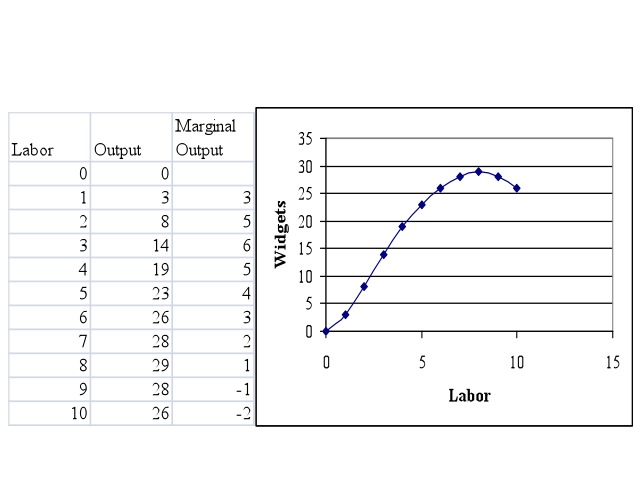
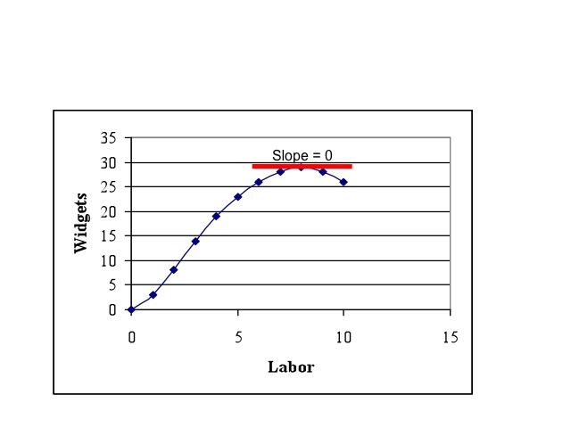
If the company wants to find how many workers will maximize their output, they would look at the point where the slope of the curve goes to zero. In our example if the company wanted to maximize output, it would use eight workers to do so.
Charts and Graphs
Charts and graphs are frequently used to display information. A pie chart shows the portion or relative magnitude of the total amount that is made up by each of the components. For example, these pie charts display the sources of federal government revenues and the main areas of federal government expenditures.
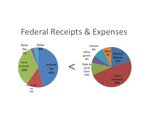
Data: 2008 Statistical Abstracts (2007 Data)
federal_govt_finances_employment/federal_budgetreceipts_outlays_and_debt.html
A bar chart shows the amount or magnitude of each item by the length of the item. In this bar chart the number of business as sole proprietorships, partnerships, and corporations are shown on the left while the respective amounts of revenue that each generates annual is shown on by the bar on the right.
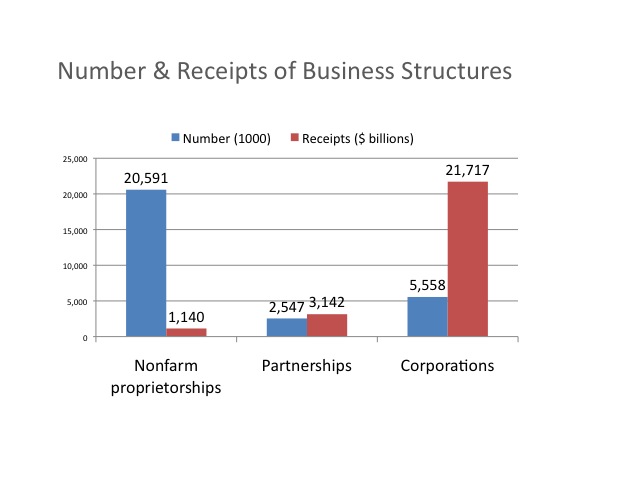
Data: 2008 Statistical Abstract of the United States (2004 data)
http://www.census.gov/compendia/statab/cats/business_enterprise/sole_proprietorships_partnerships_corporations.html
A time series displays the data values over time. Time is along the horizontal axis and the observations are evenly spaced, such as annually, quarterly, or monthly. This graph shows the receipts and outlays of the federal government using the vertical axis on the left hand side or primary axis, and the budget surplus which uses the vertical axis on the right hand side or secondary axis.
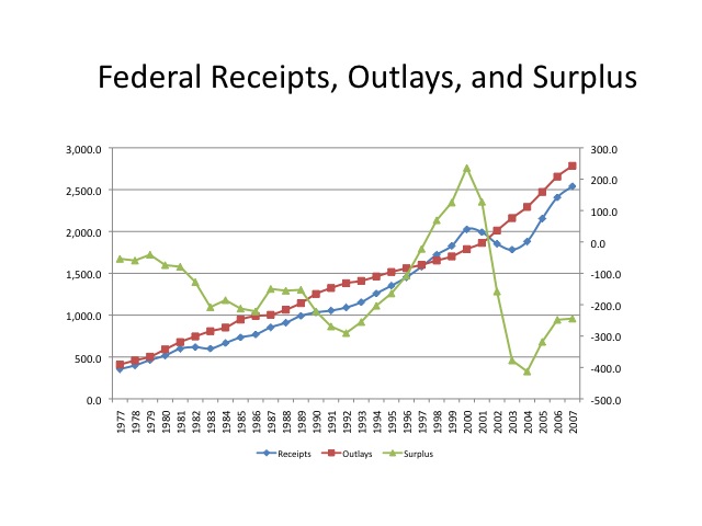
Data: 2008 Statistical Abstracts
Cross sectional data looks at various segments of a population at a point in time. This table displays the median weekly earnings and the unemployment rate in 2007, based on the level of education. As seen from the data, those with more education tend to have greater earnings and lower unemployment rates.
http://www.bls.gov/emp/emptab7.htm

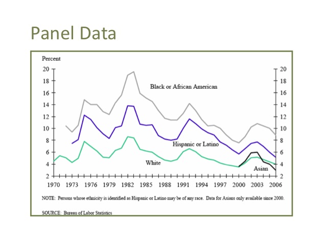
Panel data combines cross sectional information and time series. This graph displays the unemployment rate by race over time. From this graph, we can see how the unemployment rate varies by race in any given year, as well as how these rates change over time.
http://www.bls.gov/cps/labor2006/chart4-5.pdf
Another useful tool in economics is the growth rate. A growth rate measures the percentage change in a variable, and is calculated by taking the difference between the new value and the old value then dividing the change by the old value. When multiplied by 100, the rate becomes a percentage. For example, if $200 is invested in the bank on January 1 and on December 31st the amount has grown to 240 dollars, then the percentage increase is calculated by taking the $40 increase divided by the original $200 to find the growth rate of 20 percent.
Growth Rate = (New – Old)/Old x 100
Example:
Invest $200 on Jan 1 and have $240 on Dec. 31.
Growth rate = ($240 – $200) / $200 x 100 = 20%
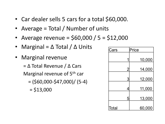
Another important concept in economics is that of average and marginal amounts. For example, if a car dealer sells 5 cars for a total of $60,000, the average revenue per car was $12,000, computed by taking the total revenue divided by the number of cars. The marginal revenue is the additional revenue per car. For example, the additional revenue from selling the fifth car was $13,000. The marginal revenue is computed by taking the change in total revenue divided by the change in the number of cars. When the fifth car was sold, revenue increased from $47,000 to $60,000, or a change of $13,000.
An individual with $30,000 of taxable income would have a marginal tax rate of 15 percent. The average tax rate would be the total tax amount paid divided by the taxable income. Since the first $7,825 is taxed at ten percent, the average tax rate is 13.69 percent.
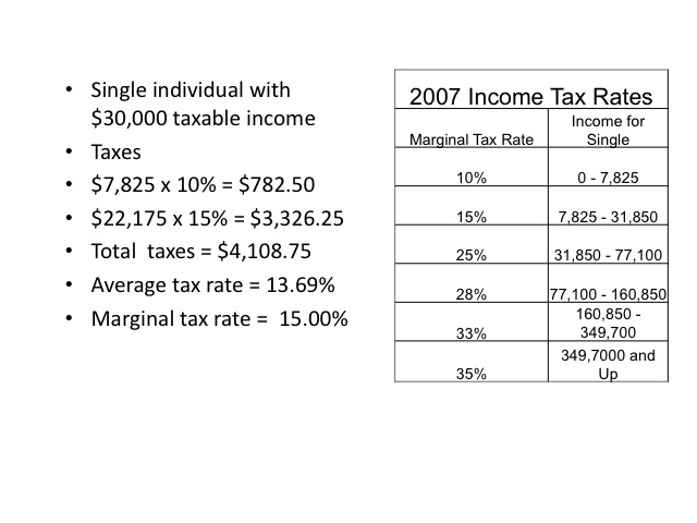
Source of tax brackets: http://www.invest-2win.com/Brackets.html
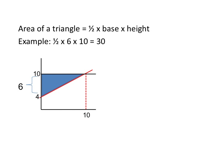
Another important concept is to determine the area of a triangle. The area is computed by multiplying one-half times the base times the height. In our example the height is 6 and the length is 10, so the area would be 30.
The purpose of math is to help simplify the complex realities of the world. Hopefully, by completing this math review you will find it easier to interpret some of the graphs and charts that you will see throughout this course. If you want a more detailed math review, you may wish to review Chapter 21 of the Rittenburg and Tregarthen text available at the web page below.
http://www.flatworldknowledge.com/pub/1.0/principles-microeconomics/28243#book-35925